Lygilega góðir gerlar
LGG+ / MS
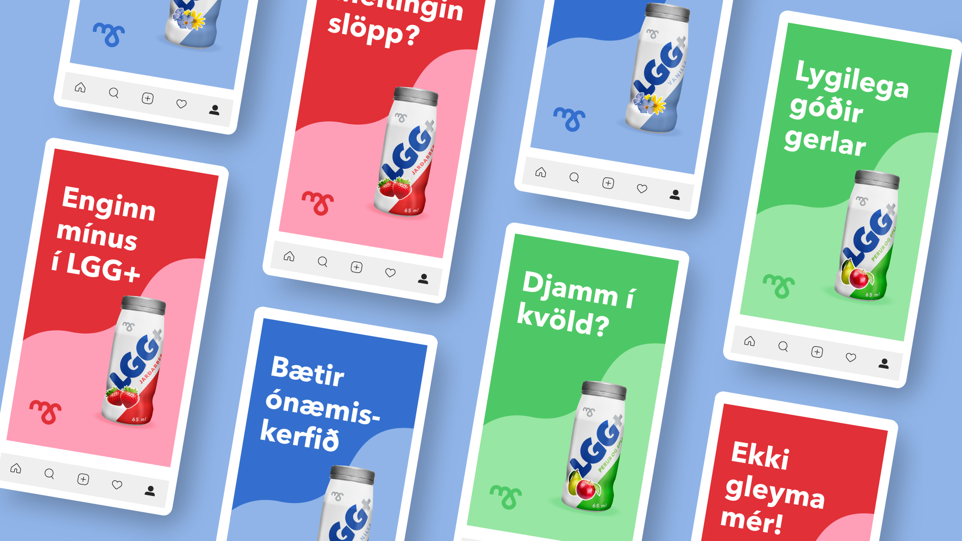
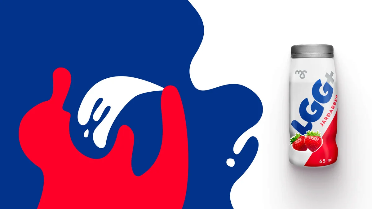
When MS redesigned the packaging for LGG+, our team at Hvíta húsið was asked to explore how motion could bring the new identity to life. The product had traditionally felt quite medicinal and aimed at an older audience, even though probiotics are relevant to everyone. We wanted to shift that perception and make LGG+ feel more playful, approachable and alive.
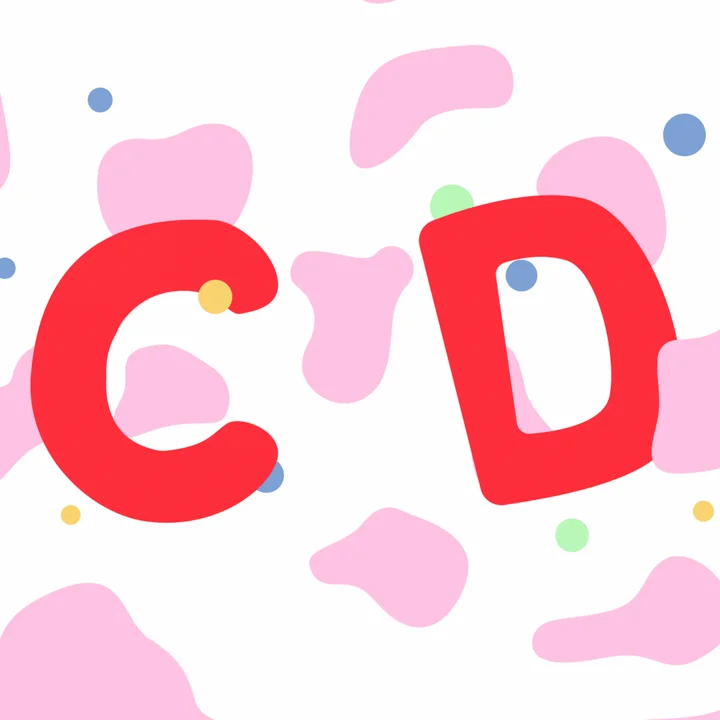
Together we developed the concept and the playful character at the centre of the campaign. We built a visual world around Lygilega góðir gerlar, treating LGG almost as an abbreviation for our own slightly ridiculous name.
I storyboarded and animated the campaign, and produced much of the content across social, web and OOH. In a second phase, we expanded the idea into contextual digital banners that played with specific words and placements, making the campaign more playful and relevant to where it appeared.
- Concept
- Helga Valdís Árnadóttir, Anna Pálína Baldursdóttir & Guðrún Jónsdóttir
- Art Direction
- Helga Valdís Árnadóttir
- Motion Design
- Guðrún Jónsdóttir
- Illustration
- Anna Pálína Baldursdóttir
- Sound Design
- Jóhann Ómarsson
- Copy
- Snjólaug Lúðvíksdóttir